Managing the Everyday Merchandising Puzzle

The Skagit Valley Food Co-op began in 1973 as a buying club in the basement of a local church. We now own and run The Co-op Building: three floors and 35,000 square feet of office and retail space in downtown Mount Vernon, Wash. The food co-op itself encompasses 17,000 square feet of that space, with grocery, kitchen, offices, a public meeting and workshop room, and a deli with seating for up to 80 people.
We just completed a remodel of our produce department and expansion of our mercantile department into our open mezzanine space. We generate approximately $10 million in sales per annum. And at last count, we were caring for over 200 plants that decorate our shelves and aisles!
Approach and follow through -- these are key concepts in the creation of successful retail programs. When it comes to merchandising at the Skagit Valley Food Co-op, we approach it as a constant, everyday puzzle.
Jenny Sandbo, merchandising manager at our co-op, works with a team of two merchandising staff and one in-house demo person to apply both creativity and critical thinking to the puzzle of product and store. Sandbo works up one 12-page flier each month-which reaches the community as an insert in local papers and is available near both store entrances-in addition to staging assorted vendor-direct promotions.
We receive orders three times a week, and every display in the store changes weekly. There are 36 displays in grocery and 50 overall. Some display areas circulate seasonally, featuring seeds from the garden center in the spring and apples from produce in the fall. Items from our mercantile section, such as tea pots and pots for plants, fit nicely into many endcap cross-merchandising efforts. What emerges is a dynamic and engaging in-store experience, with the diversity of our departments expressed and integrated into a seasonal calendar of featured offerings.
Each choice is designed to maintain the look and feel of our store, which features a deli and mercantile mezzanine, light crafted woodwork, high ceilings painted in warm colors, and tall shelves covered with antique farm tools and lots of plants. We work hard to provide a clean and inviting atmosphere, combining our professional presentation with personal touches. This is especially evident during the holiday season, when the merchandising team decorates the store with cedar boughs collected from fall storms and homemade ornaments from a staff contest, in which the prize money is split between the winning employee and the charity of his or her choice. No plastic Santa displays here, that isn’t our style-we choose natural products for our shelves, and our seasonal display presentation reflects these standards as well.
Product selection
How does the merchandising plan begin? How do we pick what goes on sale? First, an item must meet our buying guidelines: the product is healthy, a good value, and is interesting or unique in some way. Sandbo is always looking to feature destination items, like turkey brining kits during the holidays, or Hammond’s candy canes, or new sauces from Ginger People. We have some fundamental priorities: we always offer staple foods like milk, flour, and bananas at a good value, so that everyone can afford to shop here, and we highlight certain items with deep discounts for the sake of price points.
This summer, for example, we featured Santa Cruz Organic Lemonades at 99 cents. It meant we literally made “pennies a jar” in profit, so that we could foster a price image for a brand we support and have traditionally featured during summer sales. We went through 14 pallets of juice in six weeks. “That’s nothing for a big mega store, but for us that’s huge,” says Sandbo. To this end, we look to continuously spotlight items that we consider to be “good food.” Supporting the local organic bakers at the Breadfarm in Edison, for instance, is something we consider to be an investment in our region.
So, how do those products that we choose to buy and feature make it into a 12-page circular? Sandbo constructs each month’s flier according to a theme, which helps her to filter and organize the specials. She strives to include specials for each department in the store, cross merchandising them in both the flier and the endcap displays. She is out in the aisles of the store a lot, puzzling out how to work with wines as gifts for December’s flier, how to incorporate offerings from the store deli with items from grocery for the page on holiday entertaining, and then how to tie those items together in the store endcaps to create engaging displays for shoppers to browse.
When it comes to endcaps and displays, some basic systems make life much easier. The merchandising staff works from a daily tracking sheet, which numbers each display and lists what is displayed now and what will be going there next. This provides consistency for employees, and minimizes resetting. Basic rules for setting displays also help. Sandbo ties endcap displays fairly directly to the flier, but since she is putting the flier together a month and a half before setting up the displays, plenty of additional products for display become available directly from vendors in the interim.
We do lots of in-house demos which feature products from the Co-op Advantage Program (CAP), brokers, and from vendors directly. We also feature passive displays in the deli and throughout the store.
Having an in-house demo person means we can present a wide variety of products to the public actively and consistently. The demo planning happens at order time, so it too can be tied in to endcap displays. Sandbo and our demo person coordinate the schedule and then confirm in person on demo days.
We hired our demo person, who is paid hourly, about four years ago. Part of her job requirement is billing vendors. The demo monies then return to the co-op. This creates both stable employment and congruency for our customers.
Customer service is foremost
The most important aspect of merchandising, and this holds for all other positions and departments at the co-op, is customer service. We engage co-op employees in a series of trainings to encourage everyone to go the extra mile in ensuring customer satisfaction. Merchandising staff spend lots of time out in the aisles building displays, and they are key resources for customers in locating product favorites and introducing new options.
It is important to us that the Skagit Co-op be a pleasant place to shop, even when we are moving lots of product around and coordinating between departments. Some chaos is inherent in retail operations, but if our store is clean and it is easy for people to find what they are looking for, then we’ve established a strong baseline of customer service, which we can accentuate through gracious and helpful employee interactions.
“Rules” for Building Displays
We consider display building an art and are proud of what we do. Build something that makes the customer stop and look! Create abundance, think about the look and feel of your store.
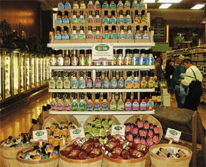
- Dummy up the bottom, build big, build high, and be symmetrical. No one buys cans of soup that are sitting on the floor. They might not buy cans stacked above eye-level either. But building high helps the display look full, abundant and worthy of a second glance. Building symmetrically also keeps the display visually balanced.
- Build big on bottom, small on top. A display that is built big on top and small on bottom-no matter how sturdy its construction-will give the impression that it is going to topple.
- No more than three products to a display. Many different items in one display can be confusing: the display becomes a jumble of signs, and the customer’s eye can’t land on anything. Keep it simple. We make exceptions to this rule when we have a bunch of small, high-end products or are featuring specialty items. In such cases we give the small items lots of space and use props to draw attention to individual products.
- Block products together. Keep product lines together, and give each flavor several facings.
- Use props to create visual interest. But make sure the props don’t become the display. Always keep the focus on the product.
- Face! All labels should face forward and all products should come to the front edge of the shelf so that they are in the light.
- They won’t buy it if they can’t get to it. Open cases, cut open the fronts of boxes in a case stack, keep all flavors accessible, and keep as much product visible as possible.
In-House Sampling Guidelines
- Recipes featured in one of our ad circulars: These most often feature seasonally fresh and local produce.
- Recipes that come to us from employees:
A popular recipe we have featured is “Ryan’s Chicken Curry.” It is a simple recipe featuring chicken, potatoes and curry. (Ryan is my son, and it really is his favorite.) - New products: We often do tastings that feature a number of products whose only relation to each other is that they are new. Customers love these-but be careful what you are pairing.
- Seasonal items: We’ll taste test several brands of sparkling drinks for the holidays or locally grown apple varieties.
- Items we feel are worth an extra push: These can be high-end gourmet items, products that challenge established brands, something we feel is part of an upcoming trend, or products that we are just really in love with.


